Bursting with flavour
The brief was simple - to create a vibrant logo and visual identity that would instantly capture attention on wholesale websites and supermarket shelves in a saturated market.
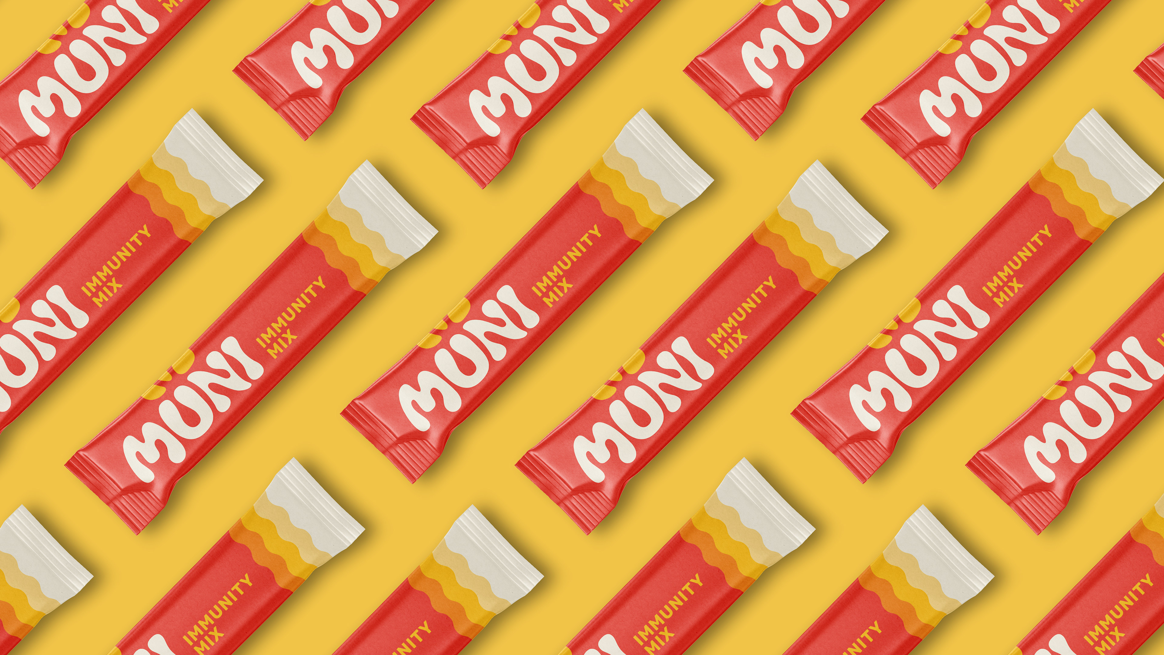
The logo uses a fun and playful custom type, again inspired by the fluidity of liquid with a fountain icon emerging from the 'U' made up from juice droplets.
We brought in this bold colour palette, and brand pattern inspired by the ripple of liquid that the immunity mix would be mixed in with. This pattern was then implemented across the individual sachets and the storage packet.
